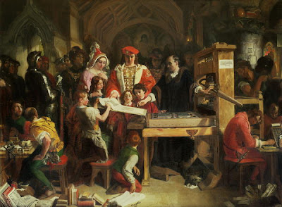
 Daniel Maclise (1811 - 1870)
Caxton Showing the First Specimen of His Printing
to King Edward IV at the Almonry, Westminster.
MissM
The thing that annoys me about Word2007
is the default font
which is Calibri (Body).
MrsM
Oh..yes! I completely understand – I love Arial.
MissM
Book Antiqua is the cool font.
MrsM
Courier makes me feel happy.
MissM
Sometimes I use Palatino Linotype;
it depends on what sort of day it is.
MrM
I’m a Times New Roman kind of guy.
.jpg)
.jpg)


Oh I like Comic MS sans because it is closest to my own handwriting.
ReplyDeleteOne of the first things that attracted me to LB was his font (Palatino).
ReplyDeleteAh, yes. Font issues. The "how many angels can dance on the head of a pin" debate of our time.
ReplyDeleteStix is due out any day now, though....
MrM sounds like Mr Bebbs :o) Solid, dependable and a little bit traditional - bless him - I feel I've always known him
ReplyDeleteTrebuchet from my limited palette on the blog but there's the right face for every occasion. It used to take us ages to choose them when designing books although more often than not we ended up with Helvetica for the pre-school list.
ReplyDeleteWhat sign is MissM? I ALWAYS use her same fonts (except I really Colibri as well).
ReplyDeleteMe, Taurus.
MrM, I wouldn't have expected anything else from you.
I had Mr M pegged as a Times New Roman man. And you thought the punctuation post would get people going.....
ReplyDeleteI love Calibri. What's wrong with Calibri?
ReplyDeleteWe were required to use Times New Roman in school, and now I'm afraid I'm set for life... K x
ReplyDeleteseriff fonts are meant to be easier to read. sans seriff are more modern...
ReplyDeleteI'm a bit of a font tart, it depends on the mood!1
Sean Jennett in his deinitive book on printing considers Baskerville the noblest of typefaces.
ReplyDeleteBut it all depends on what it looks like in italic, which is what I use when pretending (to myself)that it looks like a handwritten letter.
ReplyDeleteWord verification :- pecoea. not a font I recognise.
My name's Cathy, and I am a font junky............
ReplyDeleteCard inserts, notes to friends it has to be Papyrus for me - very 1930's. Business letters, however, Times New Roman. Do we have a psychologist amongst us? Bobby x
ReplyDeleteand then of course there's the font size to consider, some of them come out very small, so do you go up a font size to compensate. off to go and find out what font my blog is set to, I am ashamed to say I don't know, and clearly this is remiss of me x
ReplyDeleteO fons Bandusiae, splendidior vitro ....
ReplyDeleteknew a thing or two did Horace. Definitely a Times Old Roman kind of guy though
WV: caliz
Clearly MissM has her finger on the pulse.
ReplyDeleteI secretly love to download fonts - not to use, just to hoard. Angelina is a current favourite.
ReplyDeleteI'm an Ariel sort of girl too!
ReplyDeleteWe are all font freaks at heart.Its when you do the i-spy thing as vans pass you on the motorway with their company logos that you know this.
ReplyDeleteHa!
ReplyDeleteI like Times New Roman, too, and I also dislike Calibri. I have a fondness for serifs.
If GMS is looking for an elegant italic I always used to favour Bembo (both in Roman and italic). I even had our wedding invitations and service sheets printed in Bembo many years ago! However, it is not so much seen these days.
ReplyDeletegood old Wikipedia ...
ReplyDelete"More recently, Bembo is the typeface used for volumes in the Everyman's Library series. It is also the principal typeface in the Rough Guides series of travel books"
A subject close to so many hearts obviously - there's even a few films about it: http://www.helveticafilm.com/ and http://independentnortherncreative.org/
ReplyDeleteFor me it's Century Gothic at work and, like Driftwood, I have no idea what my blog is set to - still a work in (slow) progress you see.
Ha ha, we too have conversations like that, the Technical Advisor once worked in the print industry, he has very strong views on font. I do believe he has some very special, extra fonts stored somewhere on this machine. But they aren't for the likes of me, only available to those who really, truly understand and appreciate.
ReplyDeleteMy husband is a font geek. I'll send him round.
ReplyDelete